Nexus: A Multi-Platform Design System
Unified Web, iOS, and Android under one token architecture, cutting global update cycles from months to days.

Role
Senior Product Designer
Tools
Figma, Style Dictionary, Storybook
Focus
Accessibility (WCAG), white-labeling, token architecture
Fragmentation & Accessibility Debt
Nexus operates across Web, iOS, and Android, but each platform had its own disconnected design decisions. Colors and spacing were hard-coded differently in every codebase, with no single source of truth.
The legacy system also carried real accessibility debt: low-contrast pairings and missing focus states left much of the product non-compliant with WCAG standards.
Inclusive Color Architecture
A primary focus of Nexus was hardwiring accessibility into the system's foundation. Instead of arbitrary hex codes, I built a generative color system where color ramps are mathematically engineered to meet accessible contrast ratios, hitting WCAG AA or AAA by default on every screen.
That removed the guesswork for product teams and kept inaccessible designs from ever reaching production.

Automated contrast checking across the 0–1000 color spectrum, validating WCAG compliance before a ramp ships.
Context-Aware Dark Mode
Nexus served restaurants, bars, and cafes, each with its own working environment: line cooks at kitchen display screens, waiters and bartenders on handheld and stationary POS, and managers reviewing reports from a back-office desktop or the mobile web. On the floor, dim lighting and bright screens caused real eye strain, especially during night shifts. At the desk, the same strain came from hours in front of a screen.
Using the token architecture, I built a dark mode calibrated for these varied conditions, keeping every surface, from kitchen display to back-office dashboard, legible regardless of device or time of day.

White-Labeling at Scale
White-labeling needed to work across the full client base, restaurants, bars, and cafes alike. Owners wanted software that felt like an extension of their brand, not a generic utility, whether they ran a five-location group or a single independent shop.
I architected the system to support white-labeling from the ground up, abstracting colors into brand themes that could map any business's identity directly into the UI. A local pizza shop, for example, could run a POS themed to match their red-and-white branding, the kind of cohesive, branded experience usually reserved for enterprise chains.


The architecture was built to support white-labeling at scale across the full client base.
Unified Token Pipeline
Every token decision needed to reach four platforms without four separate implementations. Using Style Dictionary, I built a pipeline that took a single token definition and propagated it to Figma variables, CSS, XML, and Swift, so accessibility fixes, dark mode, and brand themes shipped everywhere at once instead of being rebuilt platform by platform.

One token definition, defined once, reaches Web, Android, and iOS automatically through Style Dictionary — Figma stays manual until an import tool exists.
To make token names carry meaning instead of requiring memorization, I structured them as a five-part hierarchy: Type, Element, Role, Variant, State. A name like color.container.brand.strong.none tells you exactly what it is, where it applies, and how strong it should render, without opening documentation. That predictability turned tokens into a contract between design and engineering — change the value once, and every consuming platform inherits the update automatically.

Tokens follow a fixed naming order — Type, Element, Role, Variant, State — so a name like color.container.brand.strong.none is self-describing across every platform.
Nexus Design System
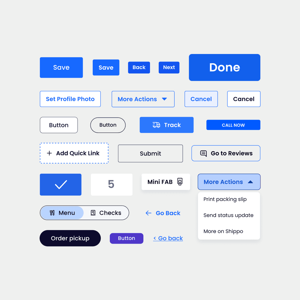
To drive adoption across the Web, iOS, and Android teams, I built Nexus: a documentation site that served as the single source of truth for every token, component, and pattern in the system. Beyond specs, it included a News & Updates section so teams could track what changed and why, plus full component documentation, like the Button page, covering variants, states, and usage guidance in one place.
The documentation site supports light and dark mode throughout, including component pages like Button that walk through every variant and state.
Figma Handoff
Dev Mode surfaced the same tokens engineers would see in code directly inside the component's inspection panel, so a button's color, spacing, and radius were traceable back to the exact token name, not just a static hex value. This closed the gap between design intent and implementation, since engineers could confirm a component matched spec without a back-and-forth Slack thread.

One System, Every Platform
Before Nexus, a rebrand or global style change meant touching each platform's codebase individually, a process that could take months. With tokens as the single source of truth, the same kind of update became a matter of changing a value once and letting Style Dictionary propagate it everywhere, cutting that timeline down to days.
More than speed, the system solved three problems at once: inclusion, through WCAG-compliant color by default; environment, through a dark mode built for low-light POS use; and business growth, through white-labeling that let the product scale into new markets without custom builds per client.

The same system rendering consistently across desktop, tablet, and phone, in both light and dark mode, without a single manual adjustment.
Up next
